Happen
Overview
Happen is a revolutionary dating app that is based on finding a match at local events. By allowing users to build a detailed profile, filter for certain preferences that can be changed at any time, and view other attendees only after adding an event to their likes.
Context and Challenge
Background
- Team
- UX Design Lead: Elizabeth Bathon
- UI Design Lead: Gavin Cochrane
- UX Research Lead: Dom Scott
- Development Lead: Thomas Wang
- Timeline: 24 weeks (October 2024 – March 2025)
- Tools: Figma, Supabase, Svelte, Vercel, AfterEffects
The Problem
The dating app market is oversaturated with apps that are virtually identical so we set out to create an original dating app that promotes meaningful, long lasting connection based on live events in the user’s area.
Goals
When this project is complete we hope to achieve these goals:
- Consistently be able to pull accurate and updated event information (e.g., name, date, location, ticket price) via an API.
- The app can handle large numbers of events without performance issues, even in high-demand periods
- Users can RSVP for events directly within the app, leveraging the Supabase API for real-time availability and ticket purchases
- A significant percentage of users RSVP for events after discovering them on the app
Process and Insight
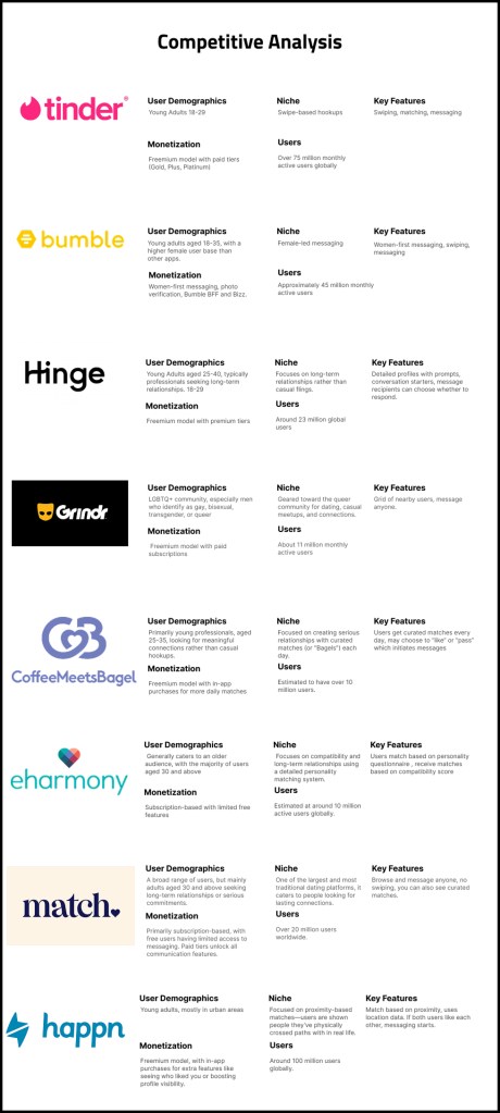
The beginning stages of our project was focused mainly on user research with the goal of finding out what people disliked and liked about the current dating apps on the market. We analyzed 8 competitors and identified the main pain points of each as well as some aspects of each app that were similar or different from the other apps.
Next we reached out to people who fit our target audience and got feedback about their preferences through surveys and interviews to get their opinions. Using the responses from this round of surveys we planned out how we could design our app to address their concerns
Once we had an understanding of the users wants and needs we began creating our first round of sketches and wireframes using the data we had gotten from our surveys and interviews
Research
Competitors
One of our big focuses during the first phase of research was looking into our competitors in order to find any common features or pain points that could be addressed in our design.
Common features
- Swiping through potential matches
- Frequent paywalls for useful features
- Unlimited messaging to matches
Major pain points:
- Lack of filtering options
- Waning conversations post-match
- Hookup Culture
- Showing users repeatedly
Using this information we found opportunities for Happen to become an app for meaningful and lasting connections based on similar interests

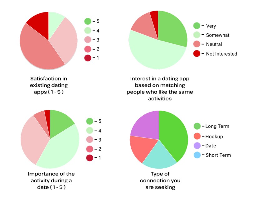
Surveys and Interviews
After analyzing our competitors we reached out to potential users and sent a survey regarding their habits on dating apps and some potential improvements. We received 62 responses from people mostly ages 18-25 which provided us with a ton of valuable information to use moving forward. We also conducted interviews with potential users to gain some higher level information regarding the pain points of current apps and consolidated that data into a list of takeaways that we used to inform our decisions when making our main features.
Key findings:
- Users showed interest in features such as:
- Inclusive gender/sexuality choices
- Matching based on shared interests
- Messaging without swiping
- Waning conversations post-match
- Hookup Culture
- Showing users repeatedly

Target Audience / User Personas
Based on our survey data, we ascertained information about the demographics and features of our typical user. The key features of our target audience includes:
- College-age
- Seeking serious relationships
- Prioritizes shared interest and values
- Frustrated by shallow texting
- Has tried Tinder
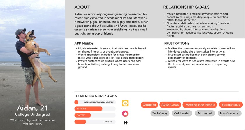
Notably, our target user has experience with dating apps but is frustrated with the lack of genuine connections in these apps.
Design Sketches
Our initial design sketches included a rough outline of an events browsing page, an events detail page, and messaging pages. Based on our surveys which showed an interest in attending events of mutual interest with dates, we included carousels of events of various categories in order to allow users to find an event of interest.
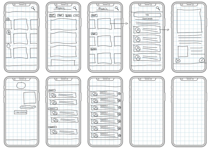
Lo-Fi
Moving into our lo-fi designs, we expanded upon our established layout. We solidified the core flow of browsing events on the main page, clicking an event to see additional details, viewing one’s liked events, and reaching out to other users who shared an interest in events.
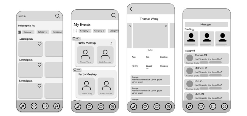
Style Guide
We then established a style guide in order to transition our lo-fi designs into high fidelity. We needed a consistent color scheme, fonts, and icons to unify our visual identity.

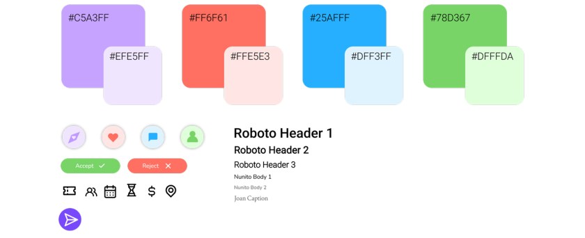
High-Fidelity Prototypes
Having created a style guide, we moved forward with our high fidelity prototypes, integrating our styles as well as high quality imagery. Our high-fi prototypes implemented color coded messages, giving visual indication on whether the message is pending, accepted, or expiring soon based on the limited time given to respond to messages.

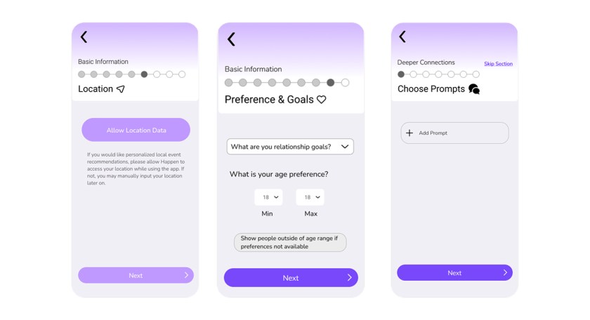
We also finalized our profile creation flow, removing and consolidating certain screens to improve the flow. We included a progress bar with named sections.
We also finalized our profile creation flow, removing and consolidating certain screens to improve the flow. We included a progress bar with named sections.
UX Testing Notes
After our UX testing we got some great recommendations and feedback on our app that lead us to streamline our onboarding process, clarify our iconography, and make our personalization options more flexible. After making these changes, users reported a much better understanding of our features and more clarity on what each button does.
Code Dev
Throughout the process of coding our app we ran into a few roadblocks involving the API we planned to use but we were able to easily pivot and find a better option that met all of our goals. We began by converting all of our high fidelity screens into static HTML/CSS then began converting those pages into svelte for our deployment. We also faced issues with version type conflicts between node.js and vite. We weren’t aware of this issue and ended up spending an entire day troubleshooting.
Final Project
Overall, this project was a success and we were able to achieve all but one of our success criteria mentioned before regardless of the challenges we faced throughout the process. We learned a lot about the value of research in this project as our first 7 weeks were basically dedicated to user research before we could start any of our designs. If we had more time on this project we would love to find an API that works for us rather than creating our own but due to time constraints we were not able to do this in the 24 week period. We also would have liked to implement a proper messaging system where users could interact with other users but unfortunately it did not fit into our timeline. The last thing we would have liked to accomplish with more time would be real data populating on our users profiles based on their inputs during the profile creation process. Although we could not get to everything we had hoped for in the given time frame we were able to create a working app that accomplished all of our goals and will help create meaningful connections as compared to its competitors
